作品简述
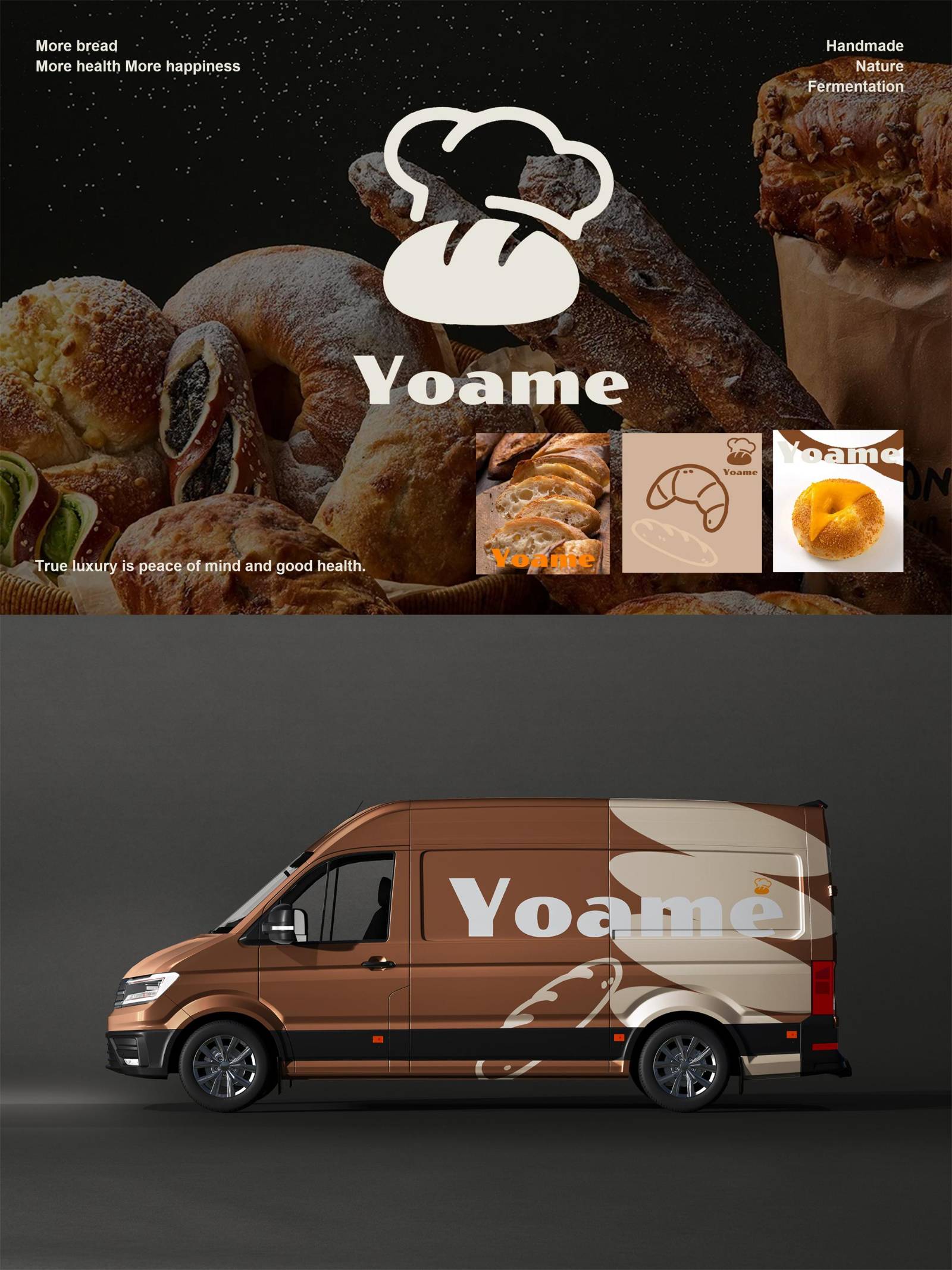
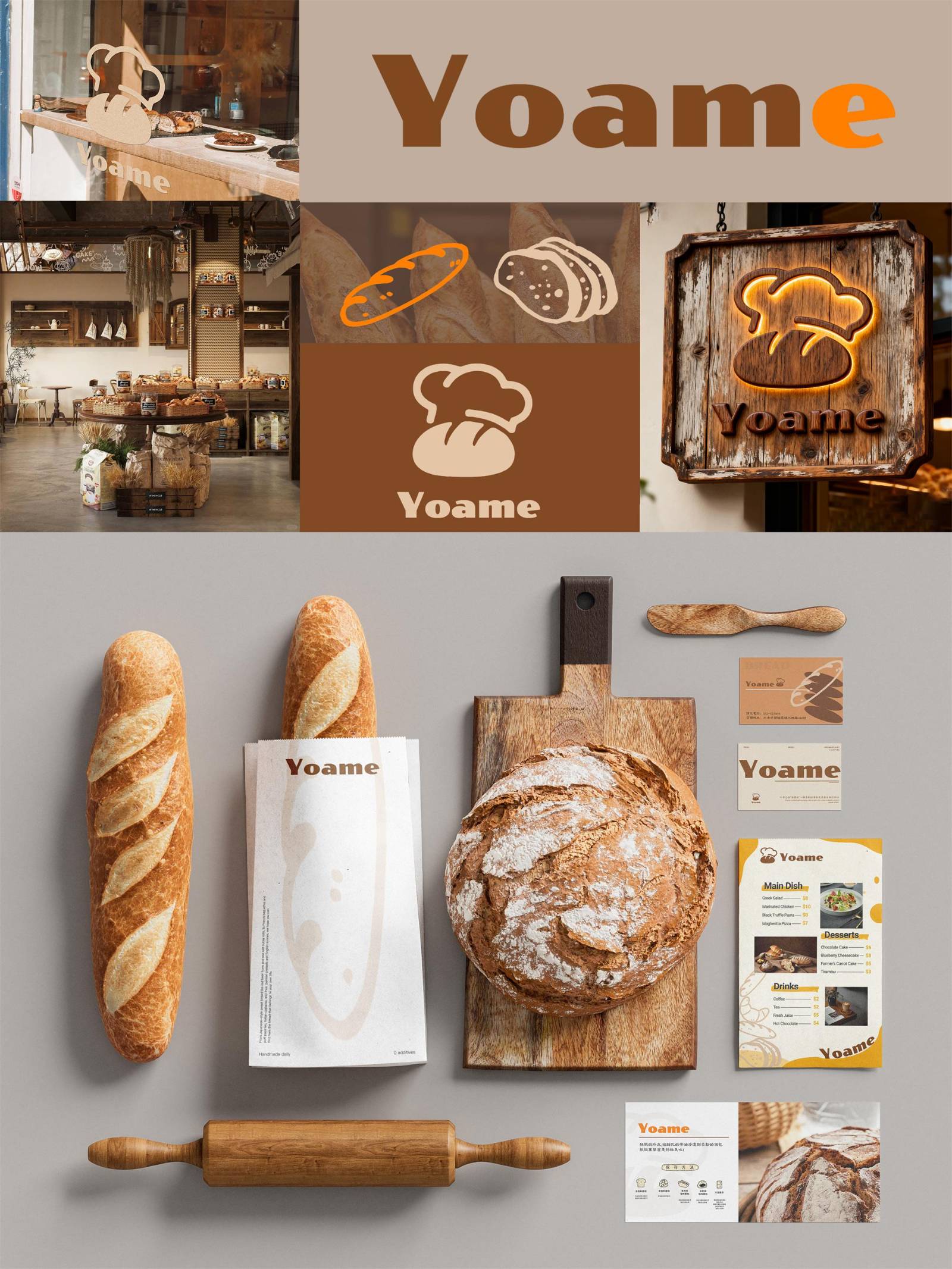
Yoame是中国一家新兴的烘焙品牌,其标识设计强调清晰而深刻的记忆点,摒弃一切可能扰乱视觉秩序的冗余元素。以面包与厨师帽(亦巧妙象征新鲜出炉的面包所散发的热气)的经典轮廓组合为核心图案,构成简洁而有力的视觉表达。
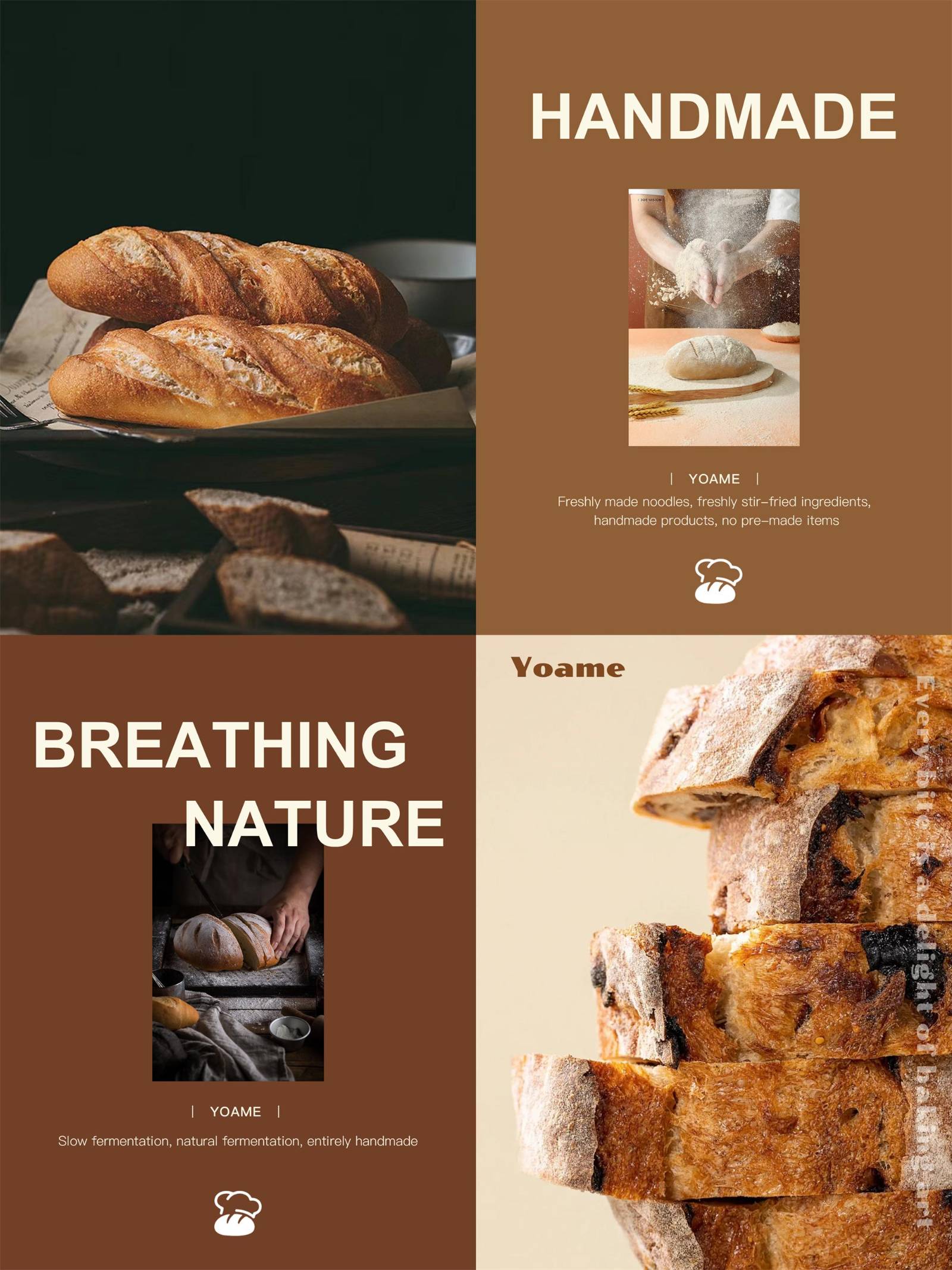
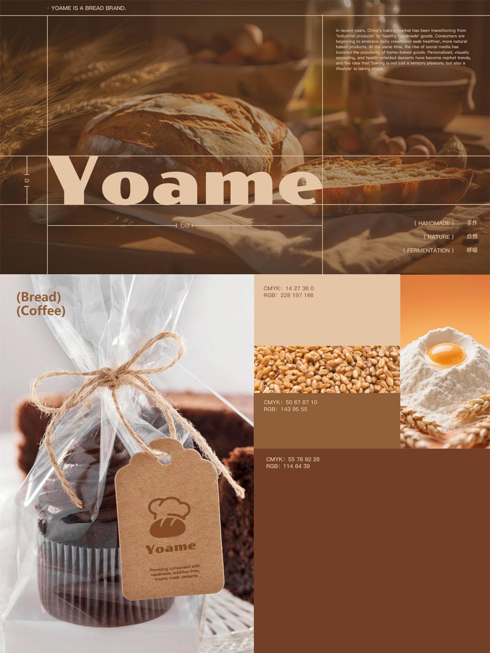
以棕色为核心色彩的暖调形成了标识明确的色彩策略,局部点缀金黄色,表现面包的色泽与烘培质感,让消费者得以直观联想到烘焙食品的美味和温暖。
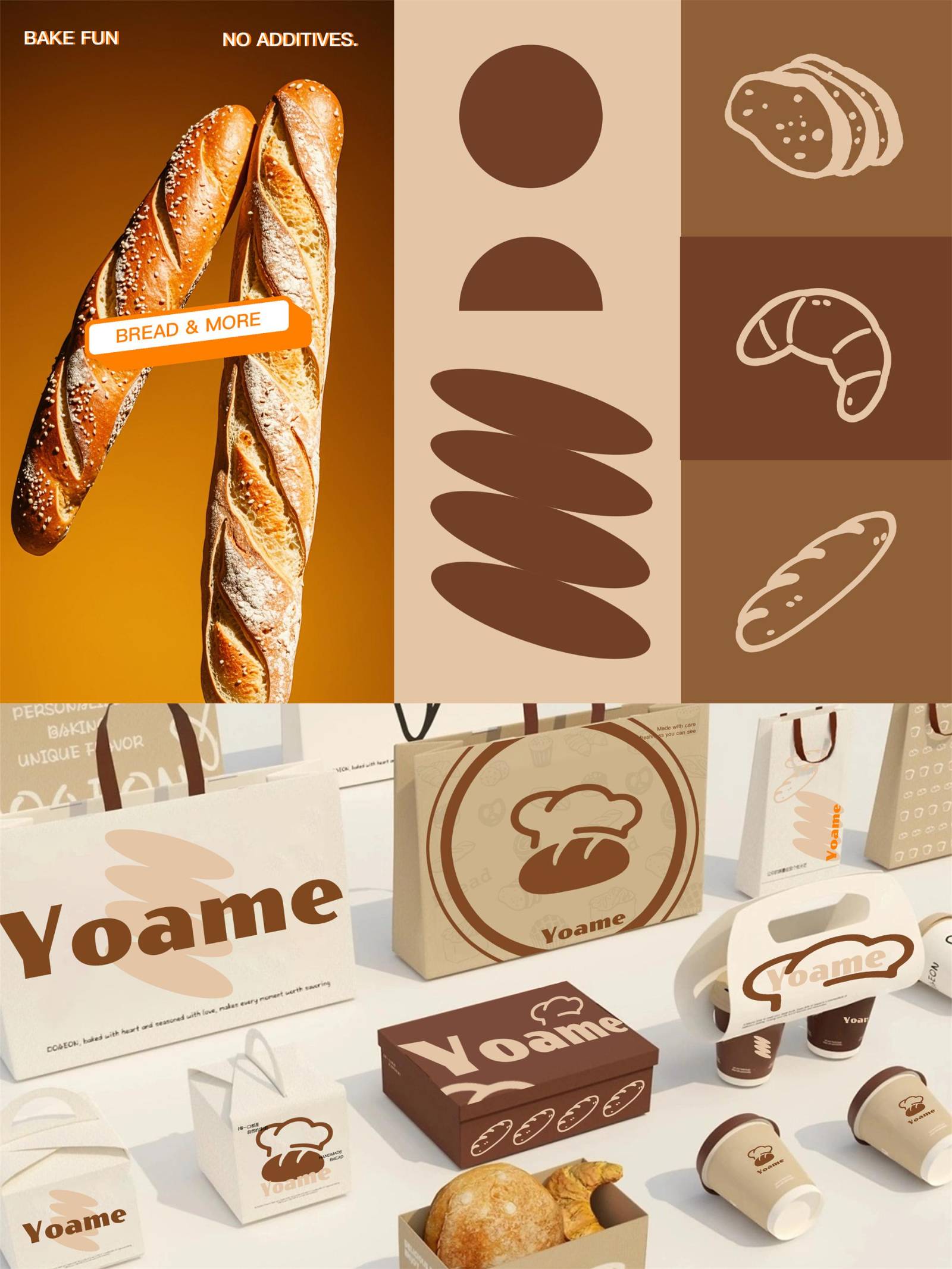
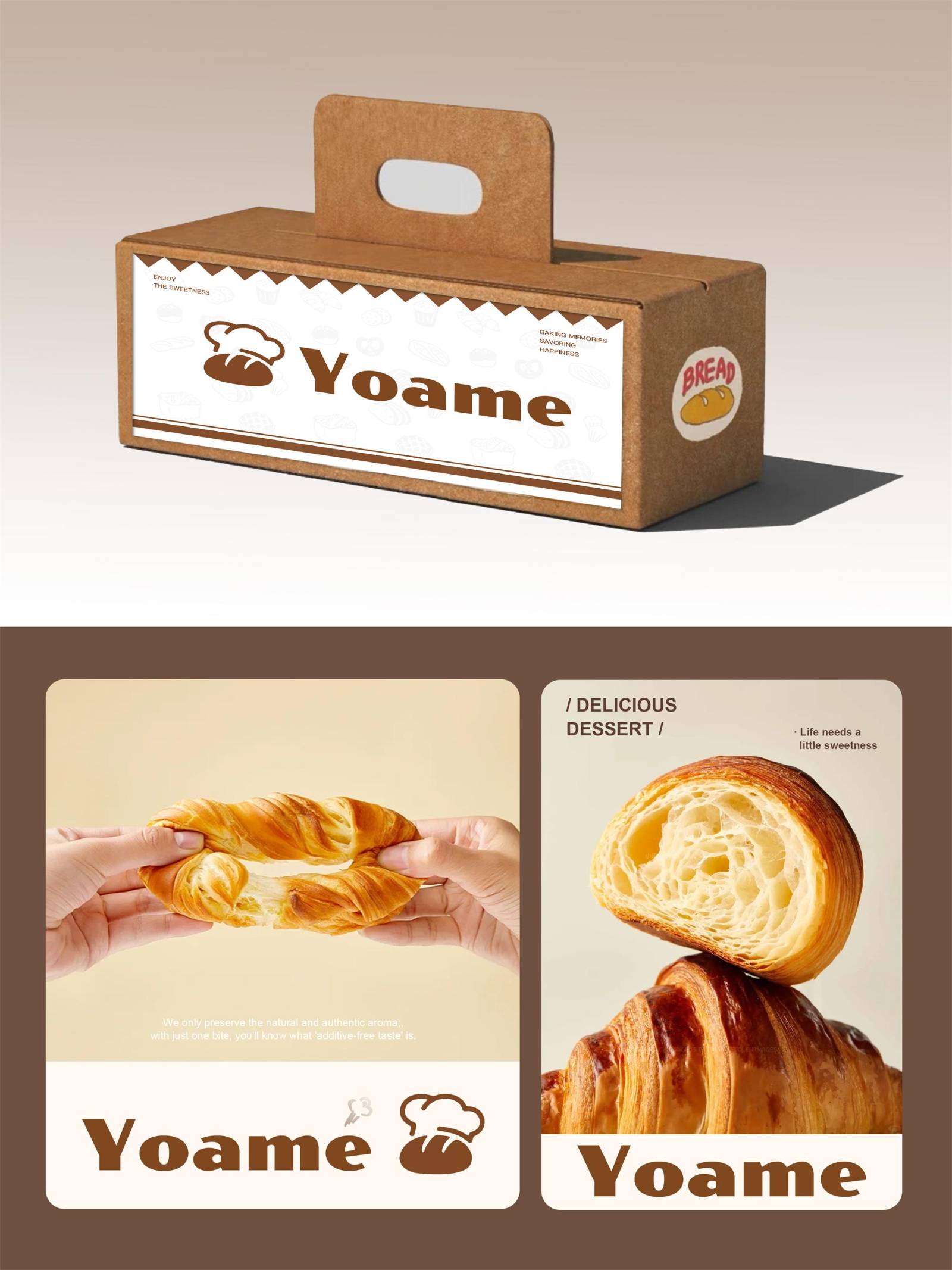
简明的设计确保了标识在各种应用场景下(如店铺招牌、产品包装、广告宣传等)都能快速被识别和记忆。例如在街头远处,消费者一眼就能看出这是与烘焙相关的品牌。
此外,通过简明的标识设计,品牌旨在向公众传递出对纯粹生活态度的执着追求:生活中无需繁复的修饰,正如Yoame的面包,仅凭简单食材便能成就温暖人心的味道。这种理念鼓励消费者珍视生活中的小确幸——一杯咖啡搭配一片精心烘焙的面包,便是最完美的日常时刻。
用户价值
在信息过载的当下,消费者注意力成为稀缺资源,Yoame标识凭借极致简洁的图形语言大大降低了用户识别和记忆品牌的成本。其次,它传递了情感连接与价值认同。“纯粹生活态度”的理念传递,精准触达了目标用户对“温暖”、“安心”、“简单美好”的情感需求。用户在看到Yoame标识时,不仅能直观联想到面包的美味质感,更能感受到品牌所倡导的无需繁复、珍视简单幸福的生活哲学。这种情感共鸣让用户在选择Yoame时,获得的不仅是味蕾的满足,更是一种对理想生活态度的价值认同。
商业表现
标识设计自发布启用后的6个月之内,品牌首店开业首月客流量突破1.2万人次,月均销售额达85万元,较区域内同类型新开业烘焙品牌平均水平高出40%;产品复购率达32%,会员体系积累注册用户超5000人。
传播价值方面,品牌标识通过社交媒体自发传播获得超50万次累计曝光,相关UGC内容累计产生2300余条,其中#Yoame纯粹面包时刻#话题登上本地生活类榜单TOP10。品牌知名度上,在目标城市核心商圈消费者品牌认知调研中,Yoame标识识别率达68%,位列同期新晋烘焙品牌第一,成功实现从0到1的品牌破圈。
社会影响
Yoame的标识设计为烘焙行业的品牌视觉设计提供了“减法美学”的示范。在当下部分品牌标识追求复杂元素堆砌以博眼球的趋势中,Yoame以极致简洁却富有内涵的设计脱颖而出,证明了通过提炼核心记忆点、聚焦情感价值传递,同样能实现强大的品牌穿透力,这为行业内其他品牌在视觉形象塑造上提供了一种回归本质、注重用户体验的新思路。
其次,在文化层面,它呼应并强化了当代社会对“极简主义”与“返璞归真”生活理念的追求。这种理念通过品牌的日常运营和与消费者的互动,潜移默化地影响着一部分人的生活态度,鼓励他们在物质日益丰富的时代,去发现和品味简单事物所蕴含的美好,从而在一定程度上推动了积极健康生活方式的传播。
团队组织
该项目核心设计团队由5位全职成员构成,在项目概念构思阶段,公司市场调研部门提前介入,通过对常州本地烘焙市场消费习惯及年轻群体审美偏好的调研,为设计团队提供了精准的用户画像与市场数据支持;设计方案初稿完成后,邀请了3位具有10年以上烘焙行业经验的资深店主作为外部顾问,从终端用户视角对标识的识别度、应用场景适配性提出优化建议,同时通过小规模用户测试(选取200名25-35岁潜在目标消费者)收集反馈,确保标识设计能够有效触达核心客群。
流程方法
该项目在流程上采用“调研-设计-验证”的闭环模式。前期通过市场调研与用户画像分析明确设计方向;设计阶段聚焦核心元素提炼,避免冗余;后期引入行业顾问与目标用户测试,从专业与消费视角双重优化,确保标识兼具美学价值与市场适应性,提升落地效果。
项目投入
该设计项目从立项到设计完成并交付总共花费了3个月时间。在此期间,项目资金总投入约12万元人民币,主要包括市场调研费用(2.5万元,用于目标用户画像分析、本地烘焙市场竞品视觉形象调研等)、设计团队人力成本(6万元)、外部顾问咨询费(1.5万元)以及用户测试与方案优化费用(2万元)。
达成情况
Yoame标识设计项目的最终目标是为了打造一个能够在信息爆炸时代快速被消费者识别并产生情感共鸣的烘焙品牌标识,通过简洁有力的视觉语言传递“纯粹生活态度”的品牌理念,助力Yoame实现从0到1的品牌建立与市场破圈。最终的结果在品牌认知度、市场业绩及用户情感连接方面均取得了超出预期的表现。
Project Description
Yoame is an emerging bakery brand in China. Its logo design emphasizes clarity and a memorable impression, eliminating any redundant elements that could disrupt visual order. The core graphic combines the classic silhouettes of a bread loaf and a chef’s hat, which also subtly symbolizes the steam rising from freshly baked bread, forming a simple yet powerful visual expression.
A warm color scheme with brown as the core color defines the logo’s distinct color strategy. Accents of golden yellow are added in certain areas to reflect the rich hue and baked texture of bread, allowing consumers to intuitively associate it with the deliciousness and warmth of baked goods.
The clean design ensures that the logo can be quickly recognized and remembered across various applications, such as store signage, product packaging, and advertising materials. For example, even from a distance on the street, consumers can immediately identify it as a bakery-related brand.
Furthermore, through its straightforward logo design, the brand aims to convey to the public a steadfast commitment to a pure lifestyle: life does not need excessive embellishment, just as Yoame’s bread achieves heartwarming flavor through simple ingredients. This philosophy encourages consumers to cherish life’s small joys, a cup of coffee paired with a carefully baked slice of bread makes for the perfect everyday moment.
User Value
In today’s age of information overload, where consumer attention is a scarce resource, Yoame’s logo significantly reduces the cost of brand recognition and memorization through its minimalist graphic language. Additionally, it fosters emotional connection and value alignment. The concept of a “pure lifestyle” precisely resonates with the target audience’s emotional needs for “warmth,” “reassurance,” and “simple beauty.” When consumers see the Yoame logo, they not only intuitively associate it with the delicious texture of bread but also sense the brand’s advocated philosophy of embracing simplicity and cherishing uncomplicated happiness.
This emotional resonance means that when choosing Yoame, consumers gain not only satisfaction for their taste buds but also a sense of alignment with an ideal lifestyle.
Business Performance
Within six months of the logo’s launch, the brand’s first store achieved a footfall of over 12,000 visitors in its opening month, with average monthly sales reaching ¥850,000, 40% higher than the average for newly opened bakery brands in the same region. The product repurchase rate reached 32%, and the membership system accumulated over 5,000 registered users.
In terms of communication value, the brand logo garnered over 500,000 cumulative exposures through organic social media sharing, generating more than 2,300 pieces of user-generated content (UGC). Among these, the hashtag #YoamePureBreadMoment trended within the top 10 of local lifestyle topic rankings. In brand awareness surveys conducted in core commercial districts of target cities, the Yoame logo achieved a recognition rate of 68%, ranking first among newly launched bakery brands during the same period—successfully breaking through from zero to one in brand establishment.
Social Impact
The Yoame logo design serves as a demonstration of “subtraction aesthetics” in the visual branding of the bakery industry. Amidst the trend of some brands piling on complex elements to grab attention, Yoame stands out with its extremely simple yet meaningful design. It proves that by refining core memorable elements and focusing on emotional value transmission, strong brand penetration can still be achieved. This offers the industry a new perspective, returning to essence and prioritizing user experience in visual identity creation.
Culturally, it echoes and reinforces the contemporary pursuit of a “minimalist” and “back-to-basics” lifestyle. Through daily brand operations and consumer interactions, this philosophy subtly influences the attitudes of a segment of the population, encouraging them, in an era of material abundance, to discover and savor the beauty inherent in simple things, thereby promoting the spread of a positive and healthy lifestyle to some extent.
Team Structure
The core design team for this project consisted of five full-time members. During the conceptualization phase, the company’s market research department was involved early on. Through studies of local bakery consumption habits in Changzhou and the aesthetic preferences of younger demographics, they provided precise user profiles and market data to support the design team. After the initial design draft was completed, three experienced bakery shop owners with over ten years in the industry were invited as external consultants. They offered optimization suggestions from an end-user perspective regarding logo recognizability and application adaptability. Additionally, feedback was collected through small-scale user testing (involving 200 potential target consumers aged 25–35) to ensure the logo design effectively resonated with the core customer base.
Flow
The project followed a closed-loop process of “research → design → validation.” Early stages involved market research and user profile analysis to define the design direction. The design phase focused on refining core elements while avoiding redundancy. Later stages introduced industry consultants and target user testing, optimizing the logo from both professional and consumer perspectives to ensure it balanced aesthetic value with market adaptability, thereby enhancing its real-world effectiveness.
Project Investment
The design project, from initiation to completion and delivery, took a total of three months. During this period, the total project investment amounted to approximately ¥120,000, mainly covering market research costs (¥25,000 for target user profiling and visual identity analysis of local bakery competitors), design team labor costs (¥60,000), external consultant fees (¥15,000), and user testing and design optimization expenses (¥20,000).
Project Achievements
The ultimate aim of the Yoame logo design project was to create a bakery brand identity that could be readily recognized by consumers and foster emotional resonance in an information-saturated era. Through concise and powerful visual language, it communicates the brand philosophy of a “pure lifestyle,” assisting Yoame in establishing its brand from scratch and achieving market breakthrough. The final results exceeded expectations in terms of brand awareness, market performance, and user emotional connection.



用户名
{{ item.email }} {{ moment(item.meta.createAt).format('YYYY-MM-DD HH:mm:ss') }}
回复:{{ item.mentioned }} {{ item.content }}
回复