作品简述
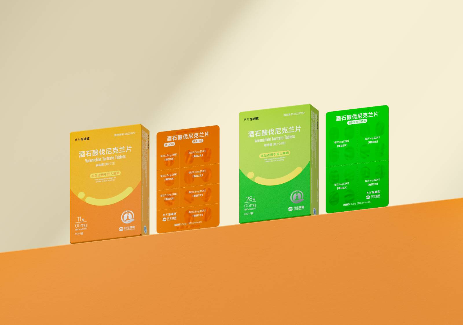
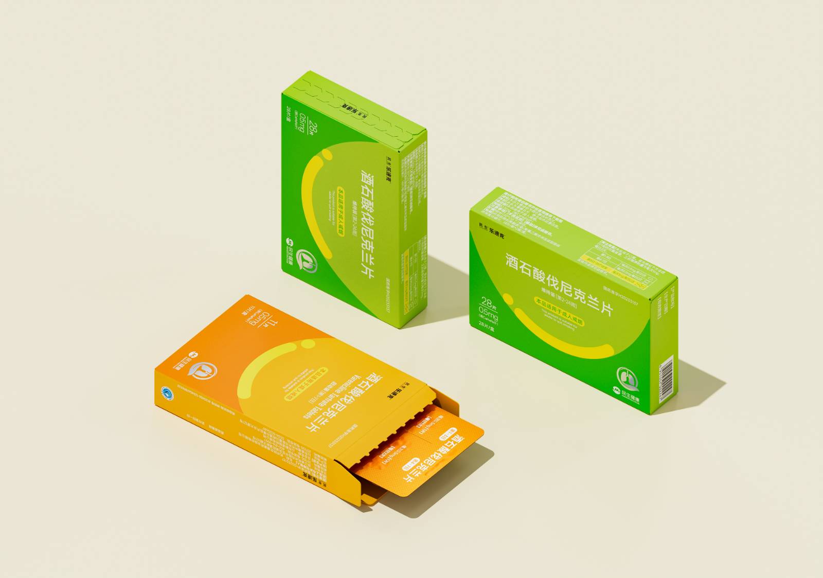
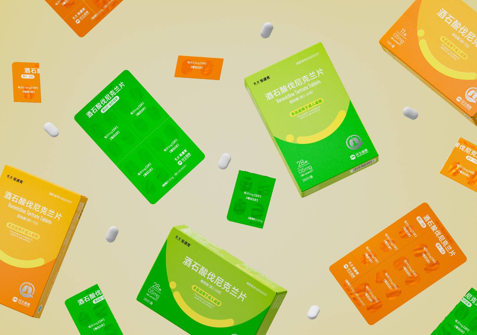
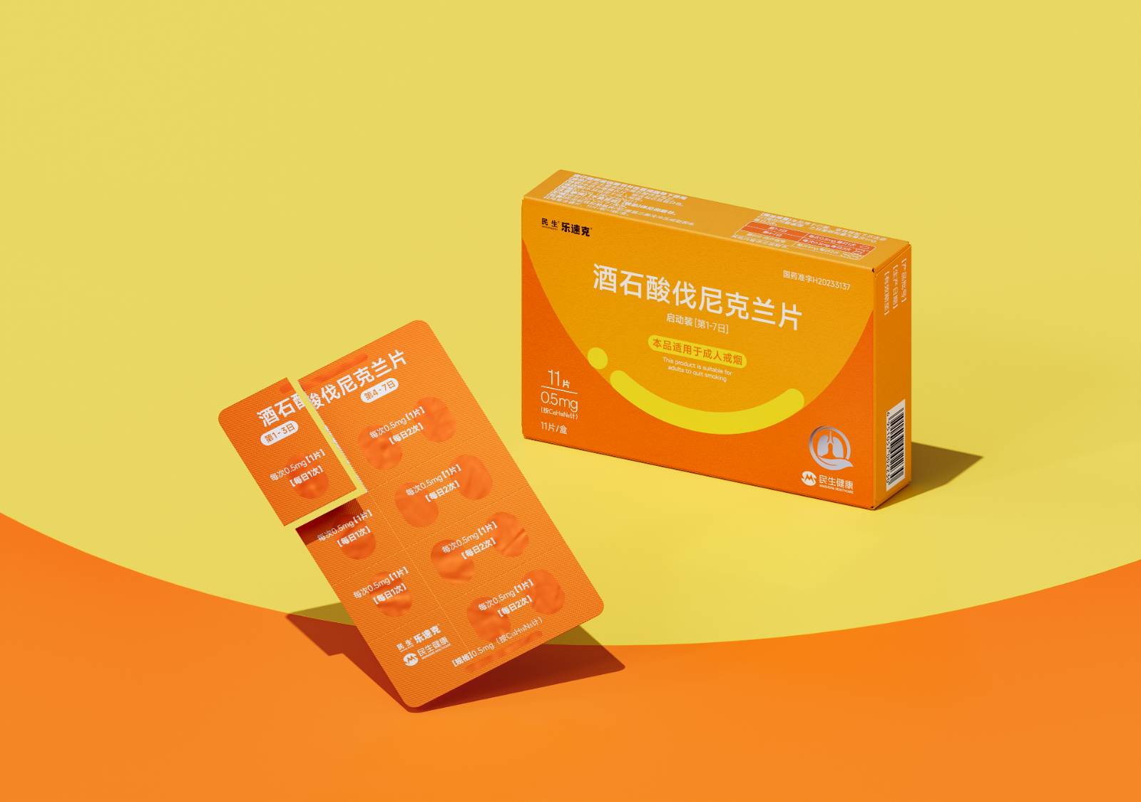
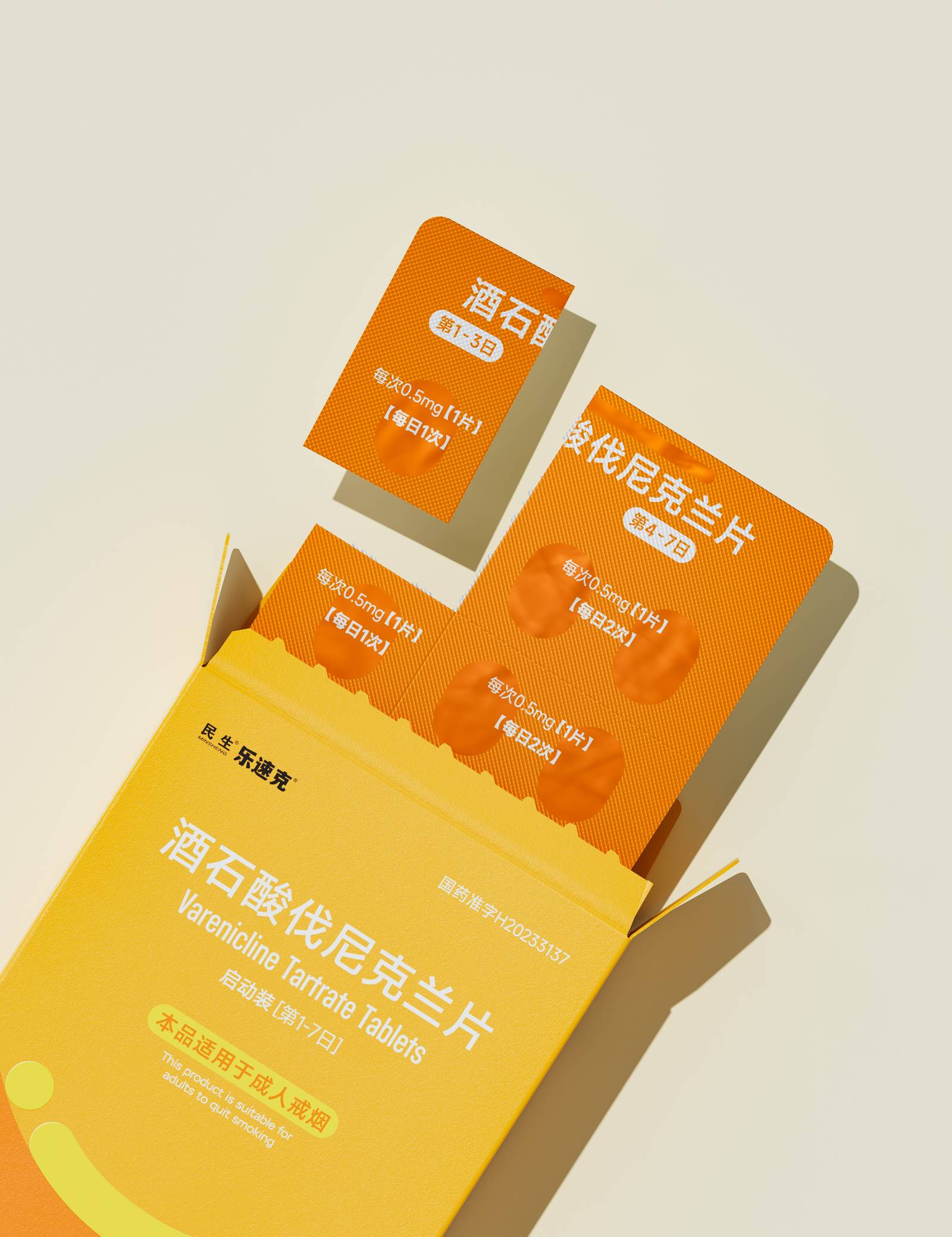
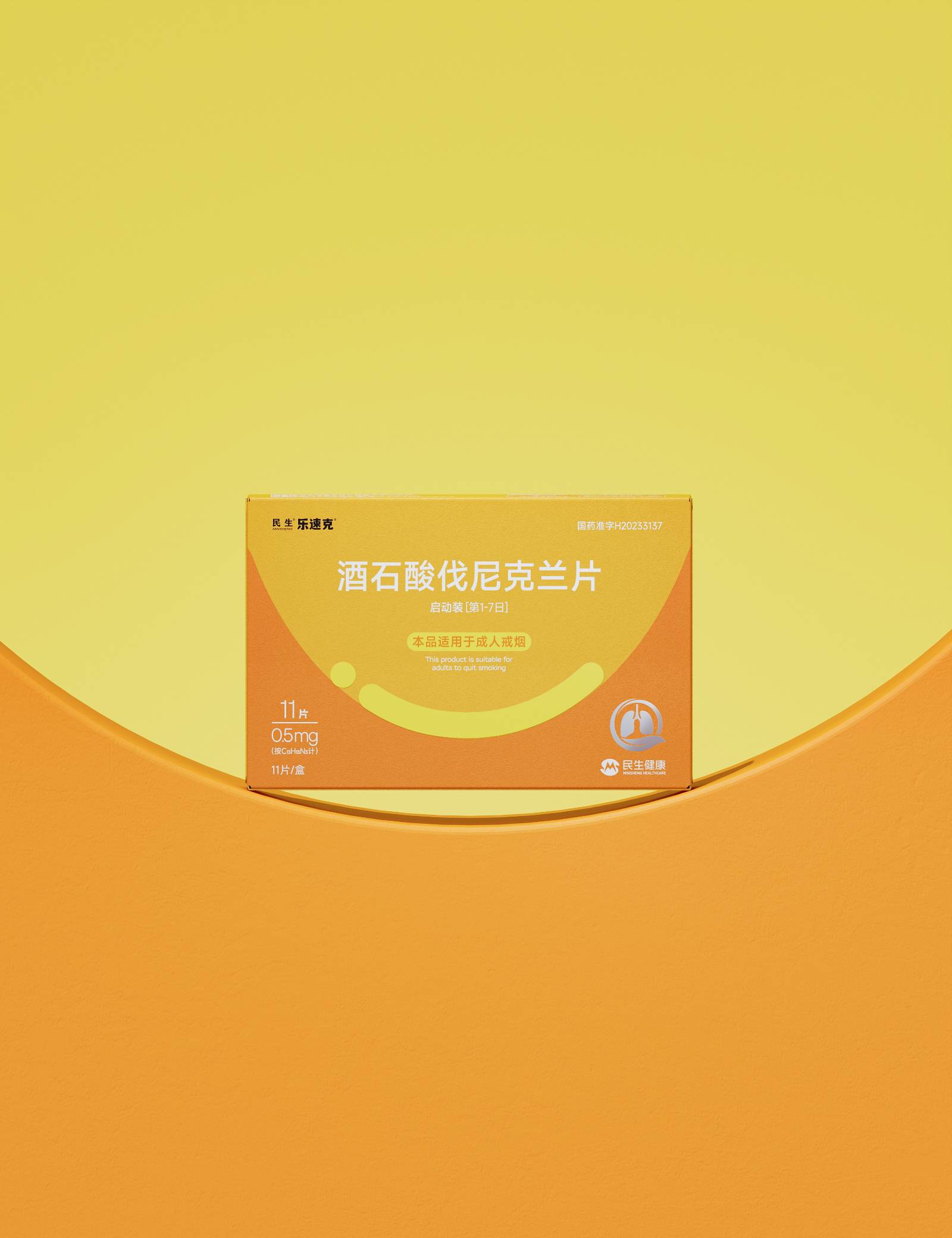
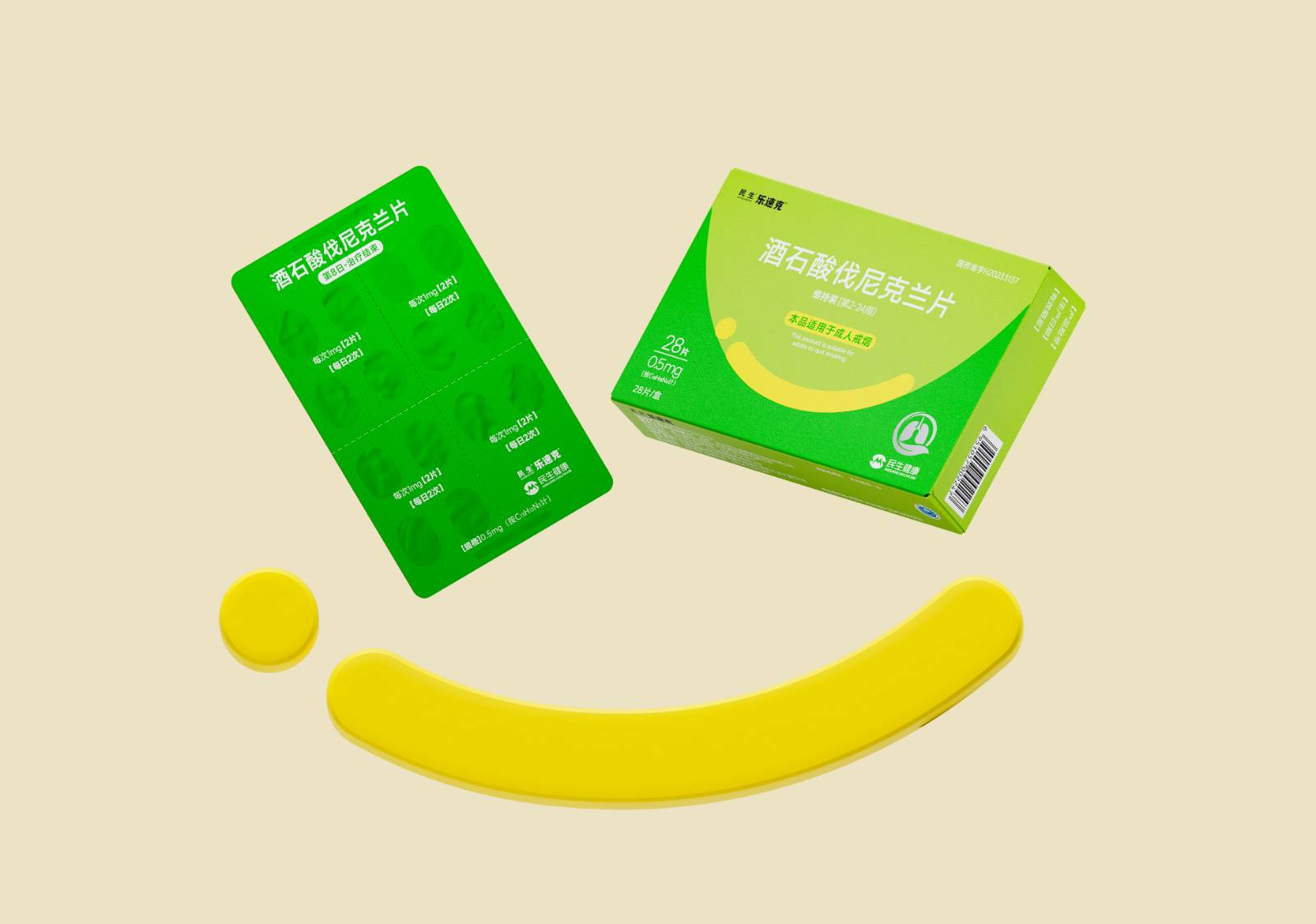
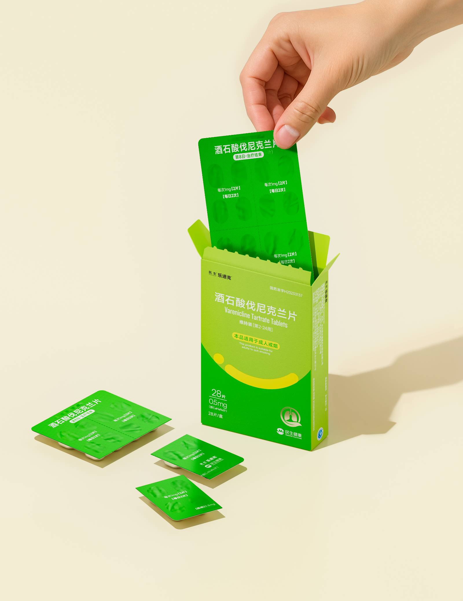
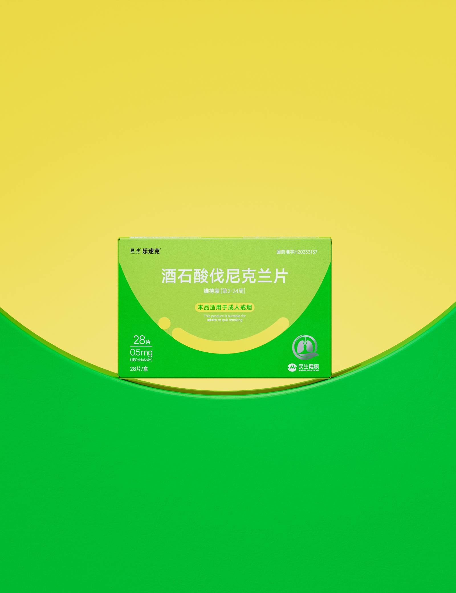
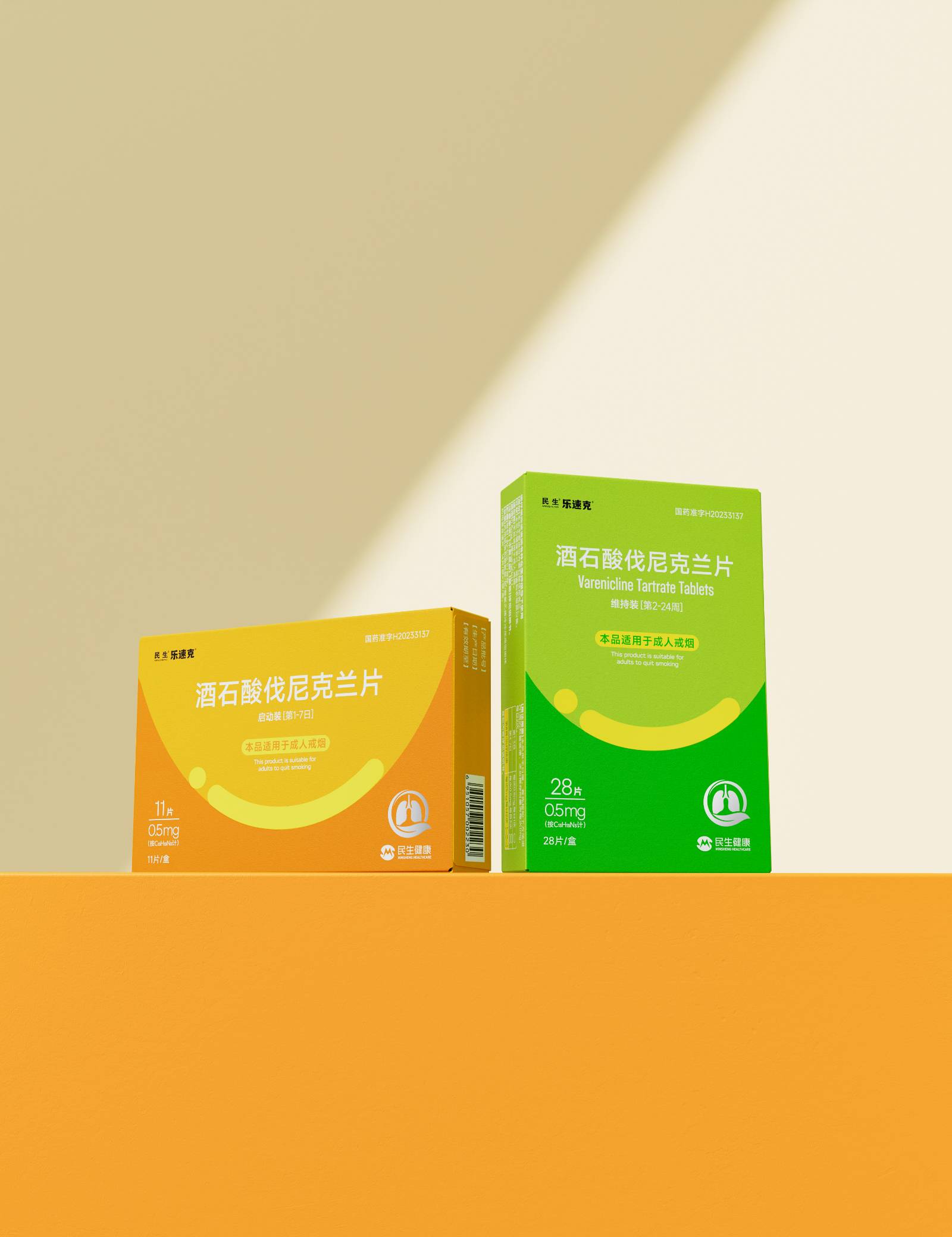
本设计是一款基于心理学原理的戒烟辅助产品包装方案。以独创的"渐进式笑脸"为核心情感符号,把乐观精神具象呈现,赋予用户正向的心理激励。同时,构建了积极的色彩叙事系统:包装分为"启动期"与"维持期"两款,主色调分别为活力橙与平静绿。橙色在治疗初期激发行动意愿与希望感,绿色则在后续阶段助力情绪稳定、保持自我认同,使治疗进程成为一段可感知的成长轨迹。"每日一格"的撕拉式剂量结构,则让服药行为演变为一种日常仪式,每完成一次取药,都是一次微小目标的实现,逐步加强用户的掌控体验。
符号、色彩与交互机制三者协同,重塑了戒烟的意义——不再仅仅是生理戒断,而是一场主动参与的健康生活方式升级。产品由此超越工具属性,成为陪伴用户前行的"积极伙伴",持续引导行为并传递支持力量。
用户价值
-基于多轮市场调研发现,传统戒烟产品包装上明显的戒烟暗示(如折断的香烟等警示图案)往往会引发用户的心理抗拒与焦虑。本项目创新性地规避了这一痛点,通过温暖的笑脸符号和积极色彩系统,消除了包装本身可能带来的负面情绪,让用户感受到温暖与支持,而非压力与说教。
-"渐进式笑脸"作为核心视觉符号,其上扬的弧线经过多轮情感测试,旨在平衡鼓励感与专业感。设计避免了过度卡通化,确保传达出医疗产品应有的可靠感与信任度。用户在感受到温暖与鼓励的同时,仍能对产品功效保持信心,从而建立起安心使用的情感基础。
-包装表面采用哑光纸质与柔触膜结合,营造出亲肤柔和的触感。不仅规避了传统药品包装常见的塑料冰冷感或纸张粗糙感,更以一种内敛温润的体验,传递出医疗级的专业质感与温暖的人文关怀,有效增强用户对产品品质的信任。
-每日剂量单元的连接处应用高精度(±0.3mm)热压撕拉线技术,确保了每一次撕拉都轻松、顺滑且边缘整齐。这种对细节的极致追求,将"轻松体验"的设计初衷落到实处,保障了使用过程的流畅与可靠,带来及时正向反馈。
商业表现
设计凭借独特的"渐进式笑脸"符号与"橙-绿"色彩系统,突破了传统处方药包装严肃、冰冷的刻板印象,有效强化了产品的视觉辨识度。这不仅帮助品牌在市场中快速建立起鲜明、温暖的形象,吸引了追求积极体验的目标消费者,也为提升品牌知名度与美誉度奠定了坚实基础。同时,包装的积极视觉语言显著增强了产品的"社交亲和力",使其具备了"自传播"的潜力,能够在社交媒体和日常消费场景中自然引发用户分享,继而进一步扩大品牌影响力。
社会影响
-在可持续性方面,包装选用可回收的纸基复合膜材料,从源头减少塑料使用,并促进资源循环利用,切实减轻环境负担。
-在用户体验层面,针对传统戒烟产品包装易加剧用户心理焦虑的行业痛点,通过情感化设计,将戒烟从令人抗拒的被动事件,转化为积极生活方式。
-在行业影响层面,开创了"行为科学+设计"的跨学科创新模式。将积极心理学原理引入包装设计,不仅提供了以用户体验为核心的新范式,更推动医疗健康行业从单一功能导向,向"功能-情感-行为"一体化方案的转型。
达成情况
设计旨在将戒烟这一"被动治疗"过程,转化为用户可掌控的"主动健康管理"。通过情感化视觉语言与互动细节,持续为用户注入鼓励与信心,缓解戒烟过程中的焦虑与挫败感。这种正向的情感支持显著提升了用户的接纳度与参与意愿,行为依从性明显增强。在此基础上,包装不再仅是产品容器,而是进化为陪伴用户逐步实现目标的"积极伙伴",真正实现了从功能载体到情感载体的跃迁。
Project Description
This design is a quit-assist packaging solution rooted in psychology. At its heart lies the original "progressive smile" – an emotional symbol that makes optimism tangible and gives users continuous positive reinforcement. A supportive colour narrative divides the pack into two stages: "Start" in energetic orange and "Maintain" in calming green. Orange sparks action and hope at the beginning of therapy; green later fosters emotional stability and self-identity, turning the treatment journey into a visible path of growth. The one-cell-per-day tear-off structure transforms pill-taking into a daily ritual: each tear completes a micro-goal, steadily strengthening the user's sense of control.
Symbol, colour and interaction work together to reframe quitting – no longer mere physiological withdrawal, but an active upgrade to a healthier lifestyle. The product thus transcends its tool function and becomes a "positive partner" that walks beside the user, guiding behaviour and conveying support.
User Value
Multi-round market research revealed that obvious quit cues on traditional packs (broken cigarettes, warning icons) often trigger psychological resistance and anxiety. This project avoids that pitfall: warm smile symbols and positive colours eliminate negative emotions, letting users feel warmth and support rather than pressure or preaching.
The upward arc of the "progressive smile" was refined through several rounds of emotional testing to balance encouragement with professionalism. The design avoids excessive cartooning, ensuring the medical-grade reliability and trustworthiness of the product. Users feel warmth and encouragement while maintaining confidence in efficacy, establishing an emotional foundation for safe use.
The pack surface combines matte paper with a soft-touch film, creating a skin-friendly feel that avoids the cold plastic or rough paper of traditional medicine packs. This understated, warm experience conveys medical-grade professionalism and warm humanistic care, effectively enhancing trust in product quality.
High-precision (±0.3 mm) hot-press tear-off lines at daily-dose joints ensure every tear is easy, smooth and edge-clean. This extreme attention to detail realises the design goal of "effortless experience", guaranteeing a fluent, reliable process and immediate positive feedback.
Business Performance
With its unique "progressive smile" symbol and "orange-to-green" colour system, the design breaks the cold, serious stereotype of prescription packaging, strengthening visual recognition. This helps the brand quickly establish a warm, distinctive image in the market, attracting consumers who seek positive experiences and laying a solid foundation for brand awareness and reputation. At the same time, the pack's positive visual language significantly enhances "social affinity", giving it self-spreading potential – naturally triggering user sharing on social media and in daily consumption scenes, further expanding brand influence.
Social Impact
On sustainability, the pack uses recyclable paper-based composite film, reducing plastic use at source and promoting circular resource use, effectively lightening environmental burden.
At user-experience level, the design transforms quitting from an anxiety-inducing passive event into a positive lifestyle choice, alleviating the psychological anxiety common in traditional quit-assist products.
At industry level, it pioneers a "behavioural science + design" interdisciplinary model. Introducing positive-psychology principles into packaging provides a user-experience-centred new paradigm and pushes the healthcare industry from single-function orientation toward an integrated "function-emotion-behaviour" solution.
Project Achievements
The design aims to turn quitting from a "passive treatment" process into a user-controlled "active health management" journey. Through emotional visual language and interactive details, it continuously injects encouragement and confidence, alleviating anxiety and frustration during quitting. This positive emotional support significantly improves user acceptance and willingness to participate, markedly enhancing behavioural compliance. On this basis, the pack evolves from a mere product container into a "positive partner" that accompanies users step by step toward their goal, truly achieving the leap from functional carrier to emotional carrier.



用户名
{{ item.email }} {{ moment(item.meta.createAt).format('YYYY-MM-DD HH:mm:ss') }}
回复:{{ item.mentioned }} {{ item.content }}
回复